Danger ‘n’ Bones:
brand voice breakdown
Edgier name stands out from traditional tarot branding, which leans towards being ‘gentle’ and ‘new age’.
This dramatic contrast in tone plays off preconceptions of tarot being ‘scary’ in a tongue-in-cheek manner while generating intrigue towards the kind of alternative experience a client may have.
Name: Danger ‘n’ Bones
Inspired by the WWII British motto “Keep calm and carry on”, this slogan is an assuring invitation that stays true to the edgy personality of the brand.
Intentional use of all lower case copy subtracts a layer of formality to emphasize the not-so-foreboding essence of the brand.
Slogan: “don’t freak out. get yer cards read”
Visual storytelling
Double skull inspired by traditional theater mask symbol representing the comedy and drama of life akin to the hopes and fears one brings to a tarot card reading.
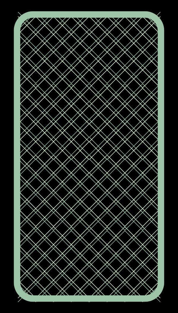
Three tarot cards re-enforce association with tarot, back facing up to represent possibilities.
Color palette friendly with current dark-mode UI trends. Ghostly greens and bright yellow emphasize the esoteric nature of tarot readings without being too on the nose.
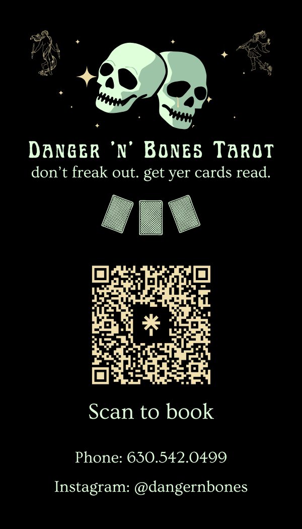
Business card front and back